Dashboard Framework
Responsive deploy-anywhere dashboard canvas
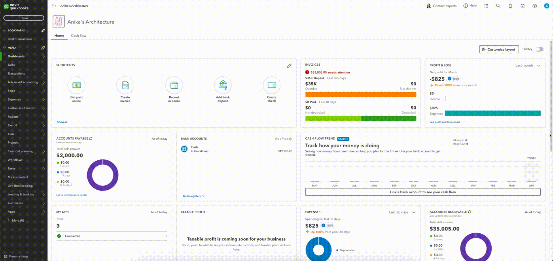
Intuit QuickBooks
FinTech
Intuit QuickBooks is a cloud-based platform for small to medium sized businesses looking to manage their finances and optimize their accounting workflow.
Seeing financial data in one place is highly important to business stakeholders, and our goal was to rethink dashboards, so users have a unified, customizable, and simple way to keep up to date with their finances.
Role and responsibilities
Primary Product Design
My role as a Product Designer on this project included the following responsibilities:
- User, market, competitive, and usability research
- Align all teams on a central customer opportunity using the jobs to be done framework
- Balance scope changes and business needs with customer value
- Create wireframes, prototypes, and high-fidelity designs
- Measure and analyze user engagement and usability metrics post-launch
- Create documentation to enable other teams to utilize our framework
- Socialize final implementations across the organization
Collaboration
I worked closely with:
- Project Manager
- Software engineers
- Cross functional designers
- Director of product (Mid-market)
- VP of product (Mid-market)
Problem Space
After receiving customer feedback about dashboard bugs and usability, I reviewed the current implementation with the goal of developing a more scalable and usable dashboard framework.
Solving the problem
Intro
As the primary Product Designer working on dashboard customization, I took lead on the research and design of several product improvements, which our team collaboratively stack ranked based on the value to our customer.
Research
To begin I started with market research on dashboards, and how widgets moved on typical working surfaces. I evaluated competitor and parallel products and created a summary for our team.
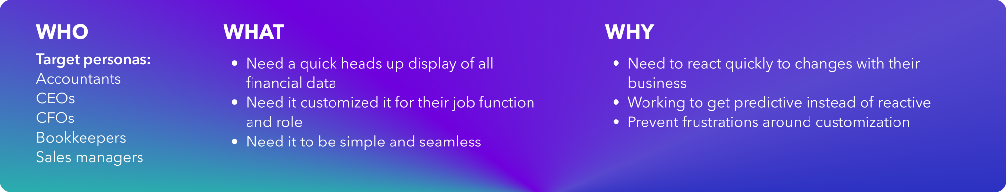
To validate findings on which key interactions were part of our users’ mental models about dashboards, I also conducted user interviews with individuals from a variety of roles (CEO/CFO, Accountant, Bookkeeper), which helped our team align on pain points and additional perceived standards when interacting with a dashboard.
Design
Ideation
Since we already had a base product to being with, I arranged a jam session with some of the developers and other designers responsible for V1 of the dashboard framework.
- We did some live digital whiteboarding to work through each challenge, and come up with the best possible solutions for each of the pain points identified
- I worked with a PM to stack rank each of the modifications in order of importance to the user experience
Wireframing and User Testing
Initial lo-fi wireframes were completed quickly based on our live session, and I was able to test with a cohort of users to validate our solutions. I also used these to validate technical limitations with our working team of engineers.
After validating our initial wireframes, hi-fidelity prototypes were also created including a “fake-o-test” where we prototyped animations between states to get users opinions on ordering of elements and animation styles.
Outcome
Implementation
We decided on a phased rollout to slowly test our way into the final implementation of all changes across the product
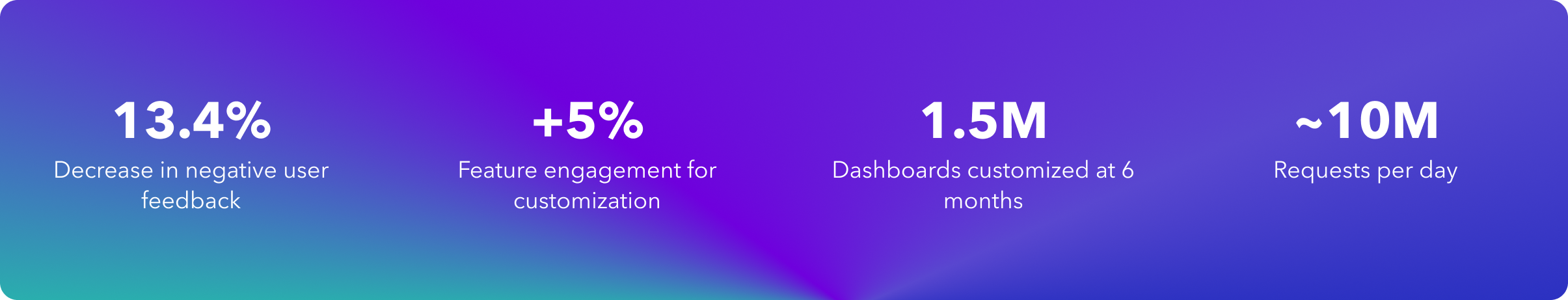
- We started with enabling animations during dragging – this saw an immediate user feedback improvement, and our negative voice of the customer slowed dramatically
- We next rolled out our widget library, which garnered positive feedback from customers, as well as our ecosystem partners who could now contribute to a library of widgets
- We added a save mechanism which would prompt the user if they attempted to leave the page without saving, to ensure their re-arranging was saved
- We added responsive widget sizing to enable a more seamless transition between breakpoints
Results
Learnings
- Customers believed they knew exactly how widget customization should work, until you showed them a slightly more complex scenario.
- Ultimately clarity involves ensuring your end user knows why/how you’re doing something, especially if you’re doing it on their behalf. Interaction design can provide this transparency sometimes.
- When you allow customization, the complexity of a dashboard becomes infinitely larger.
- Allowing customization is seen as a standard feature, not a nice-to-have.
- Sometimes just drawing some boxes and asking users to imagine something can be as powerful as a prototype.
Tools and Tech
- Figma / Figjam
- UserTesting.com
- Zoom
- Comms tools (Slack, Outlook, Calendly)
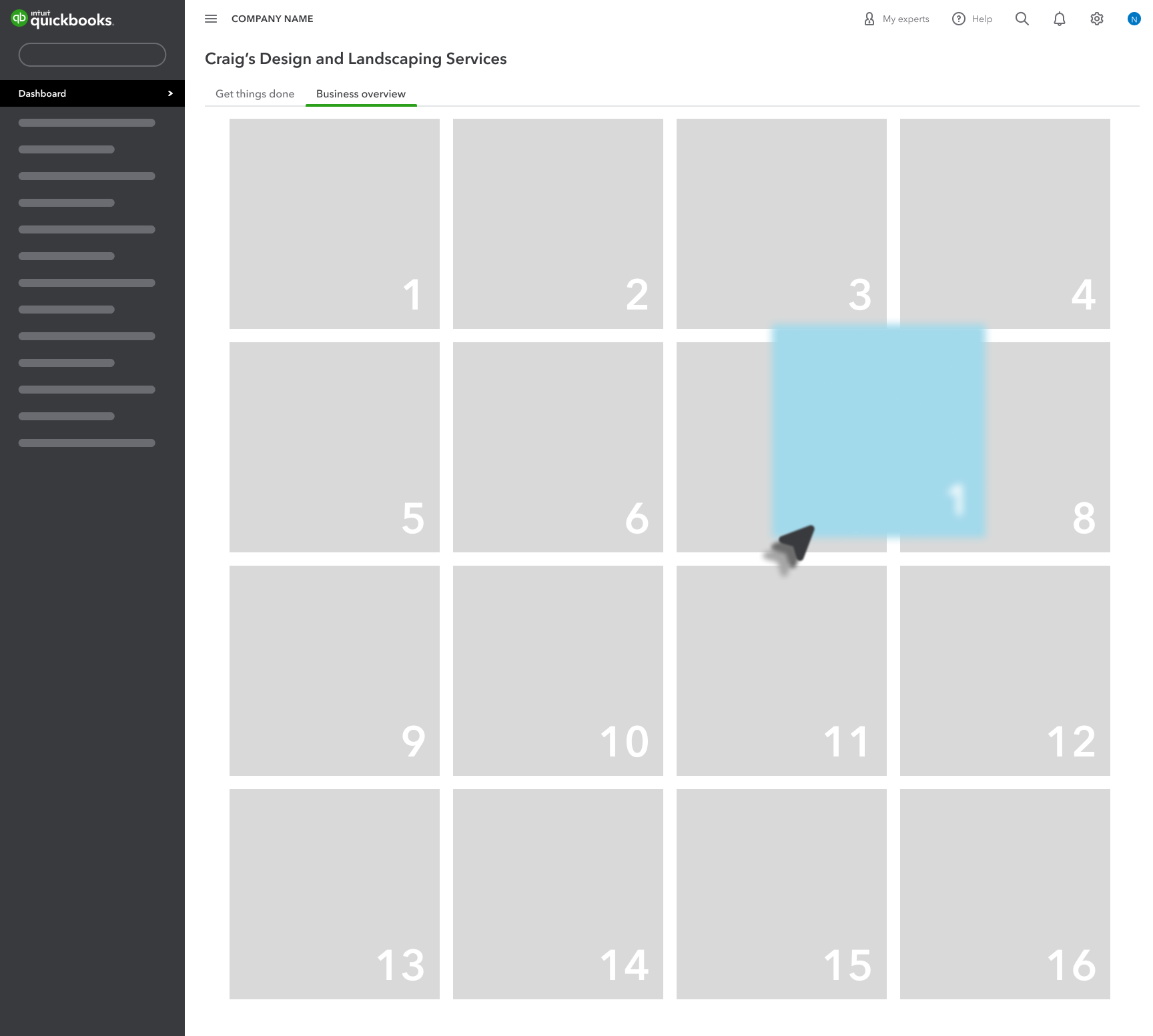
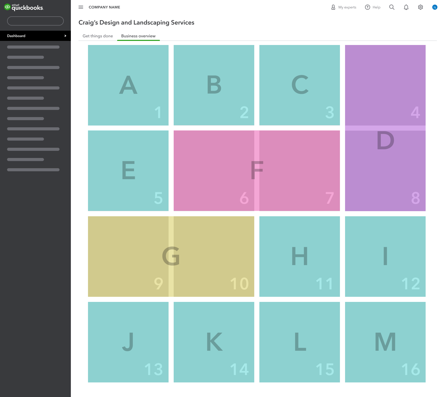
User testing – Widget re-ordering
Heuristic analysis
Dashboard framework documentation