Developer Portal
developer.intuit.com
developer.intuit.com
FinTech
Intuit’s developer portal is a space dedicated to third party organizations which develop apps for Intuit products – typically QuickBooks Online.
We offer documentation, tools, support, and a community to help our third party developers build incredible integrations which extend QuickBooks Online into the apps that their customers use on a daily basis.
Role and responsibilities
Primary Product Design
My role as the Product Designer on this project included the following responsibilities:
- User, market, competitive, and usability research
- Alignment of cross functional teams on primary short and long term goals for the developer portal
- Own the end to end design and creation of the portal, as well as a supporting design system which extends the stock Intuit design system
- Content design focused on voice and tone, reading level, and clarity
- Work closely with Intuit developers to keep design and engineering closely linked and focused on delivering customer value
- Measure and analyze user engagement and usability metrics post-launch
- Create short and long term roadmaps to ensure we could get to market fast, but continue to improve over time
- Socialize final implementations across the organization
Collaboration
I worked closely with:
- Project Managers
- Software engineers
- Cross functional designers
- Director of product (Mid-market)
- VP of product (Mid-market)
Problem Space
Our developer portal was overdue for a rebranding, but at the same time suffered from some challenging interactions and workflows which were getting in the way of developers new and experienced being able to create apps quickly and effectively. Since we were already working towards a rebrand, it was a fantastic opportunity to solve for some of the problematic workflows which were derailing our developers and costing them precious time and resources.
Solving the problem
Intro
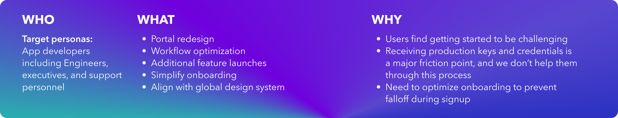
I started by setting up a brainstorm with our team of engineers, PMs, and other designers to form some customer-backed problem statements that could help us narrow in on the ultimate goals for our new portal to solve. We knew we had to create unity with the Intuit primary brand, and rethink how developers interact with our developer portal. We didn’t just want to repair what currently existed, but focus instead on how we could follow them along through their jobs to be done.
Research
To begin I started with some quick competitive analysis on other developer platforms, dove deep into analytics and customer feedback, and met with engineers and PMs to understand the reasons behind how certain pages in the app creation and publication flow were set up. In parallel the PM team was also conducting user interviews with some key developer partners to understand gaps for apps of various different scales.
Design
Ideation
Using our current site for reference, I started by laying out current flows and then marking up where improvements were needed. I tend to work best by white-boarding (digital or otherwise) and in this case it was really helpful to be able to start to identify friction points. Once we had the flows mapped, it was easy to start identifying remedies for the pain points, and ultimately streamline many of the pages.
- I started with the design system components already available from the global design system.
- I created a few options for a landing page with several different focus areas (community, getting into the system and started, learning about our APIs, jumping into documentation)
- I tested these with several developers to understand how we could help them get to their destination as quickly as possible.
- I also optimized flows for the onboarding and app creation
- We also addressed pain points with managing apps, and a very cluttered user interface that was difficult to navigate
- I worked with our PMs to stack rank each of the modifications in order of importance to the user experience
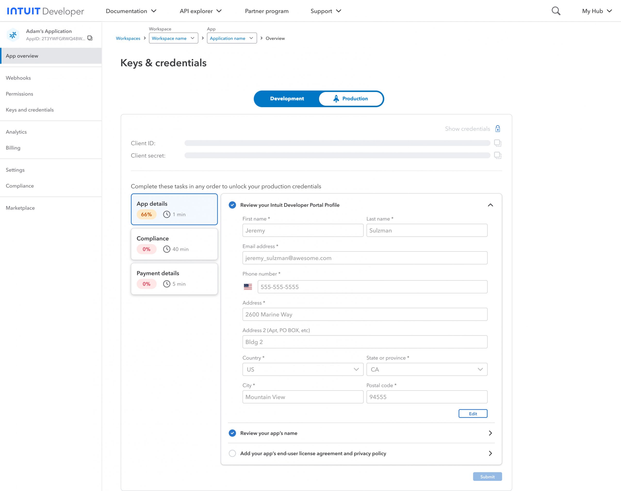
Wireframing and User Testing
Initial lo-fi wireframes were completed quickly based on our initial designs, and I was able to test with a cohort of users to validate our solutions. I also used these designs to validate technical limitations with our working team of engineers.
After validating our initial wireframes, hi-fidelity prototypes were also created in order to complete unmoderated user testing.
Outcome
Implementation
The deployment was deeply challenging – any major UI update often has negative feedback and often feels jarring to users. To combat this we did a few things:
- We worked our way into the full launch with small ramps – starting with 10 users and testing for feedback. We also gave them an option to revert (temporarily) as needed, in case they were having trouble getting something done in the new portal.
- We ramped up to 100 users to once again validate with a smaller cohort and get a temperature check on the new version. We maintained the switcher for the new/old experience.
- We performed several more ramps and although these were largely for performance and stability testing we did still very closely monitor feedback
- Once the design was pushed live for everyone, we still maintained the switcher and monitored to understand who was switching back, and why.
- As of March 2nd, the old version will be deprecated as users in the old view are now virtually non-existent.
Learnings
- The initial rollouts were received surprisingly well – this was attributed to solving some additional key customer pain points in addition to the new design. This was my major takeaway – don’t change UI for the sake of an update unless you have some value to add to offset some of the potential negative views of a change.
- The design feedback was largely positive with the look and feel being considered “more professional”, “much cleaner”, and “Easier to use”
- Catering our content towards developers specifically was a huge win – there’s a line between being helpful and sounding patronizing, so content design was a key part of this strategy
- Alignment on the primary customer problems to solve was a key in ensuring we kept scope tidy, and we did end up pushing some major items further down the roadmap not because they weren’t valuable, but because they didn’t solve the initial customer problems we had decided would be the key to success.
Tools and Tech
- Figma / Figjam
- UserTesting.com
- Zoom
- AI / LLM (ChatGPT, Writer.ai)
- Comms tools (Slack, Outlook, Calendly)
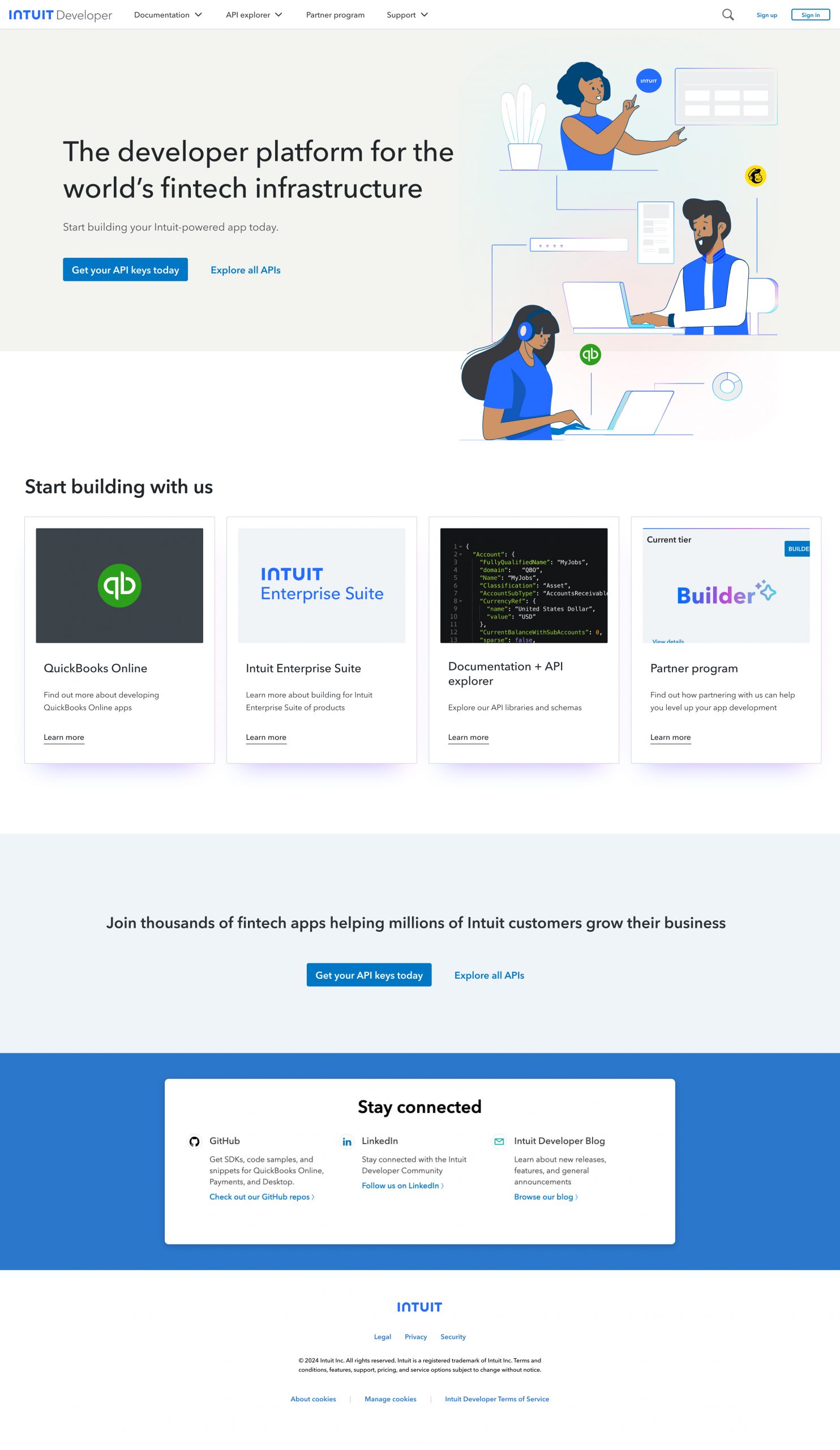
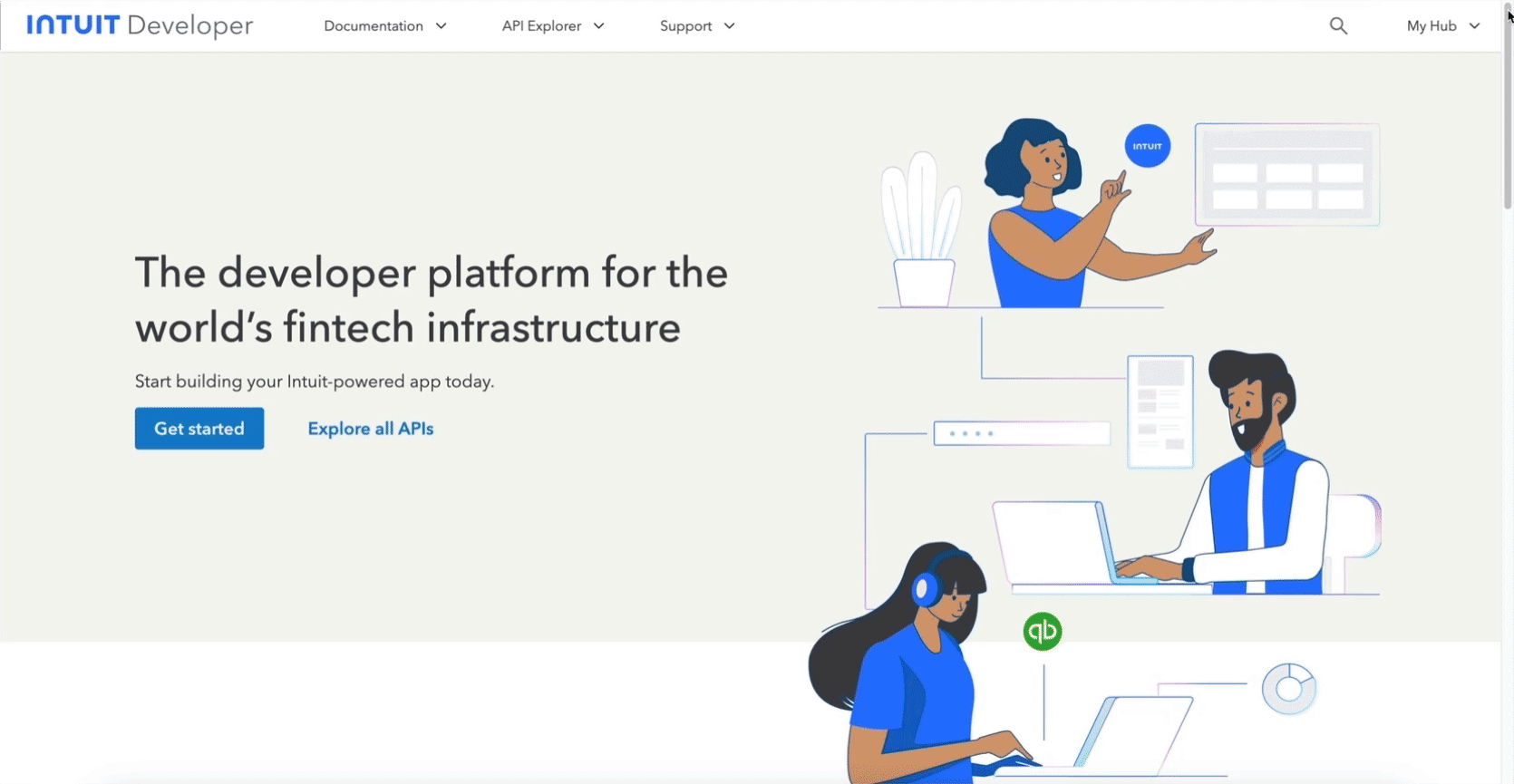
From – The previous developer portal
Brainstorming
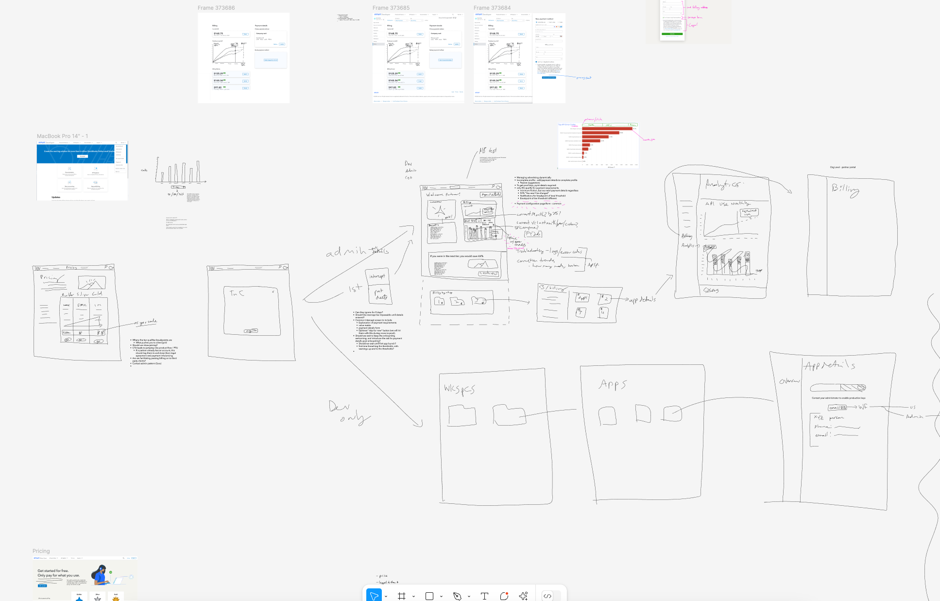
Flow mapping
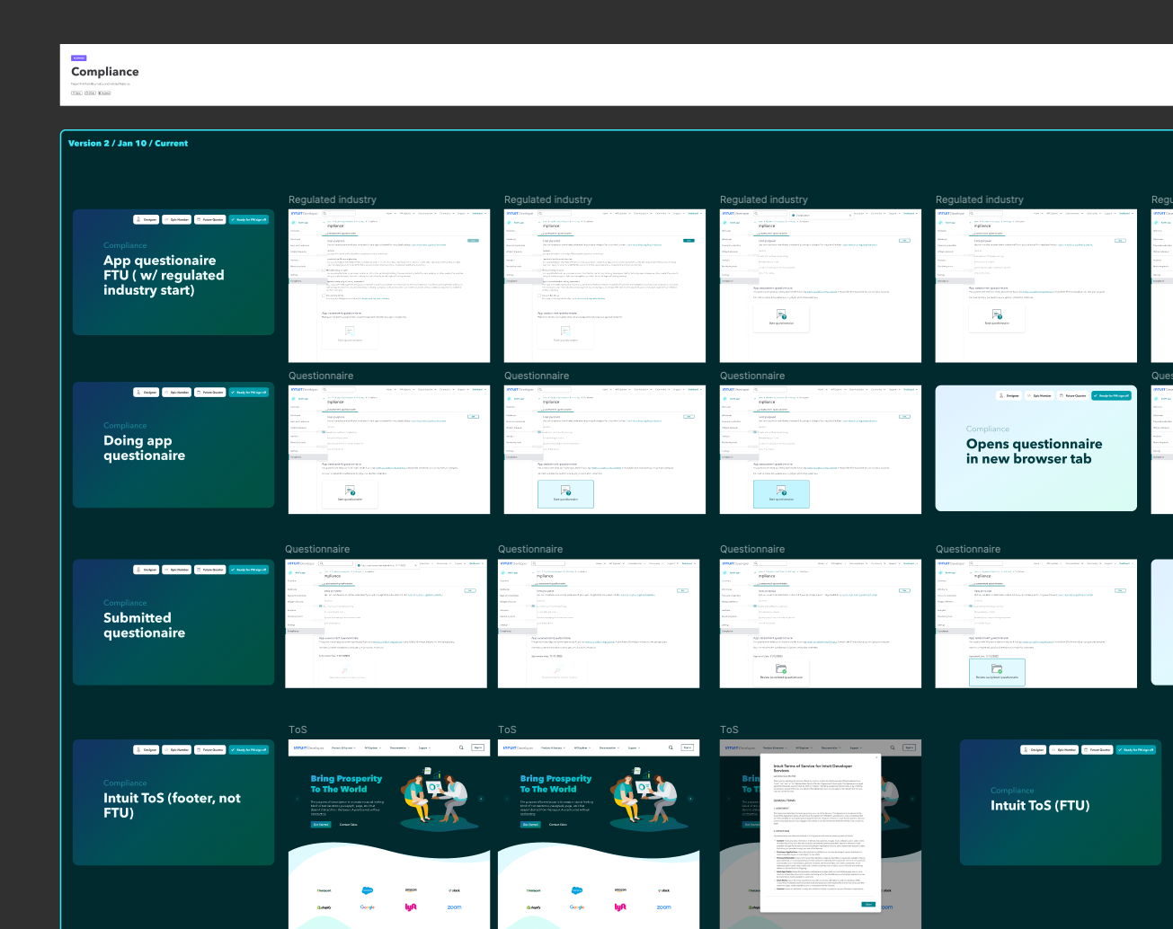
Production keys flow reimagined
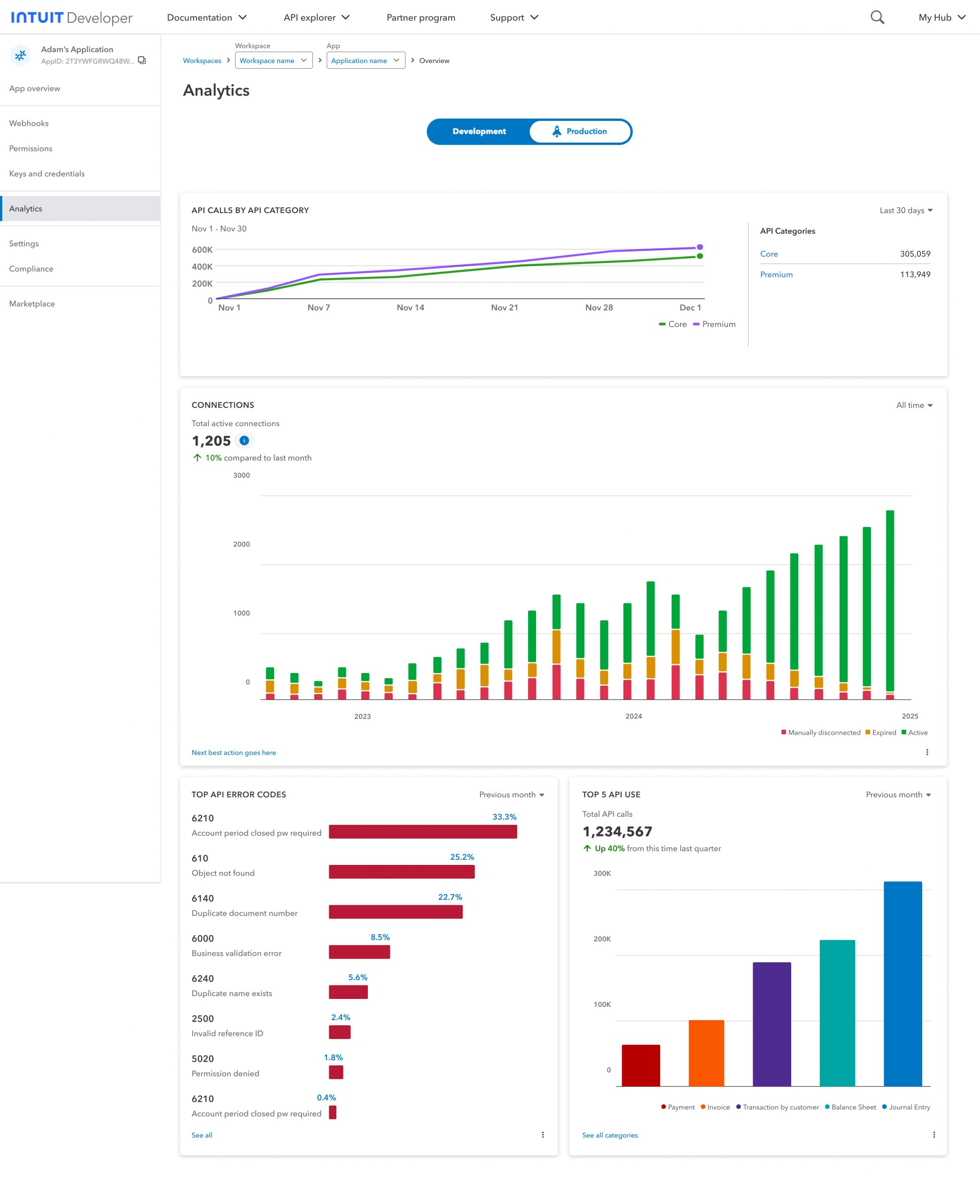
Additional analytics
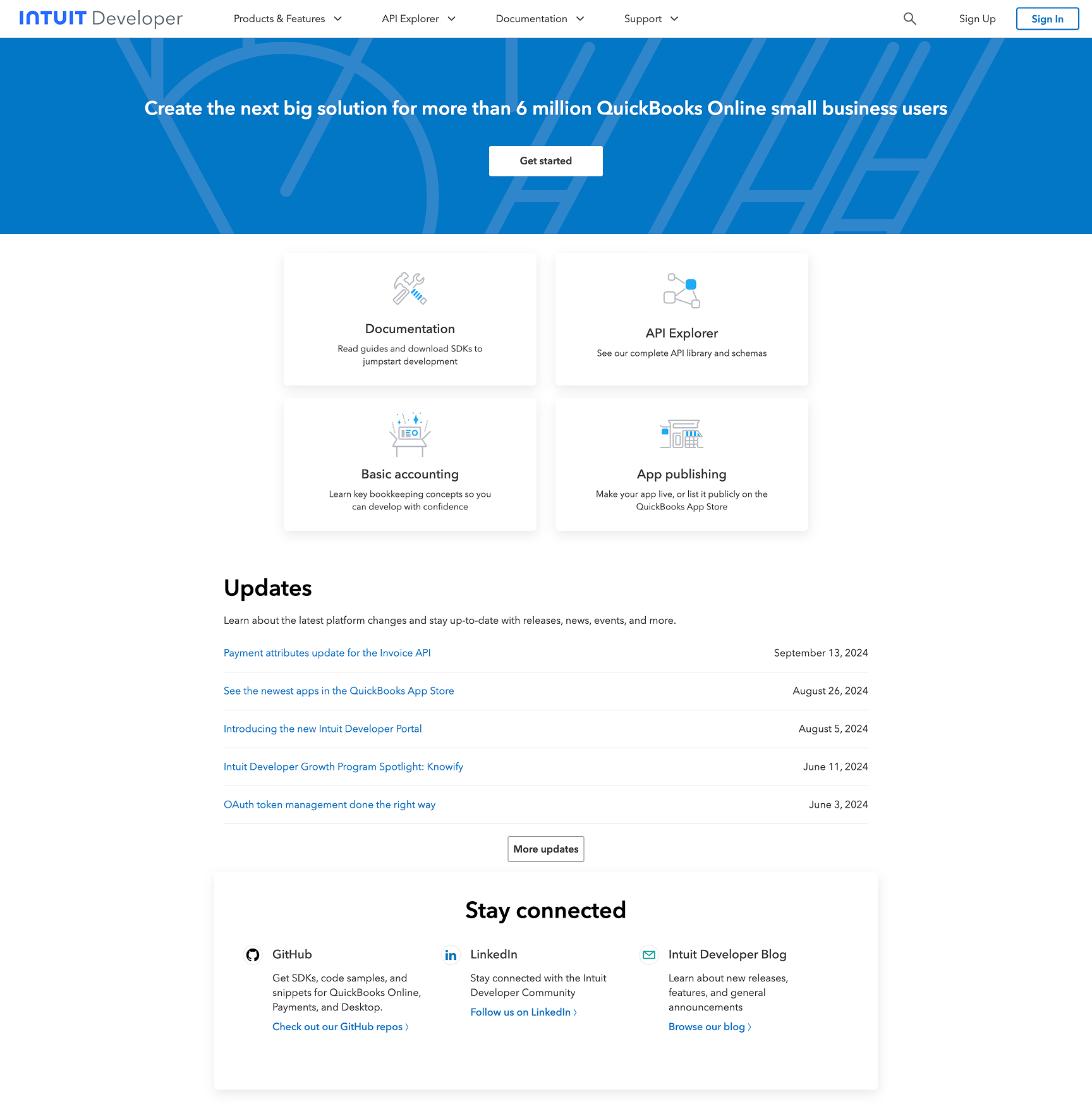
Homepage relaunch